Before
Notice how Customer Name and Segment merged into one output

After
Much better!

We’ve all been there. Banging our heads against the wall wondering that the heck is going on with our Tableau report. Why is Tableau merging fields together instead of keeping them separate? All we really want is to output a simple table that reports out on some detail level data. How hard could this possibly be? Tableau however has other plans. You see, Tableau is a data visualization tool, not excel 2.0 and they make that very clear to users through limiting certain features.
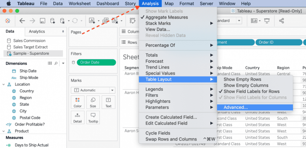
Tableau has masterfully hidden the Table Layout section within the Analysis menu item. Please keep in mind that this change must be made on each individual Tableau worksheet as there is currently no way to setting this feature at a global level within Tableau.
The screenshots below will walk you through the process. I’ve also linked a video I put together demoing this process (Video Tutorial).
Select the Advanced Table Layout menu item from the the Analysis drop down

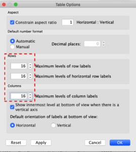
These values will need to be updated from the default 6 to 16 (max)

Please try to keep table usage to a minimum as using large tables in Tableau will drastically impact your report performance. The reason for the performance hit is due to the large number of text marks that Tableau has to output prior to enabling the end user to interact with the report.
E.g. If you are displaying a shorter table with 500 rows, only a subset will be visible on your screen. You’d need to scroll down like a webpage to view the rest of the content. Each and every row, although not immediately visible, is required to be queried on and viewable, even if you can’t see it. That’s why having a table with thousands of records will absolutely crush your performance. 99% of the time when users are experiencing poor performance it’s because tables are involved.
Please try to visualize your data in chart form and keep tables behind the scenes or in reporting tools that specialize in displaying tabular data.

